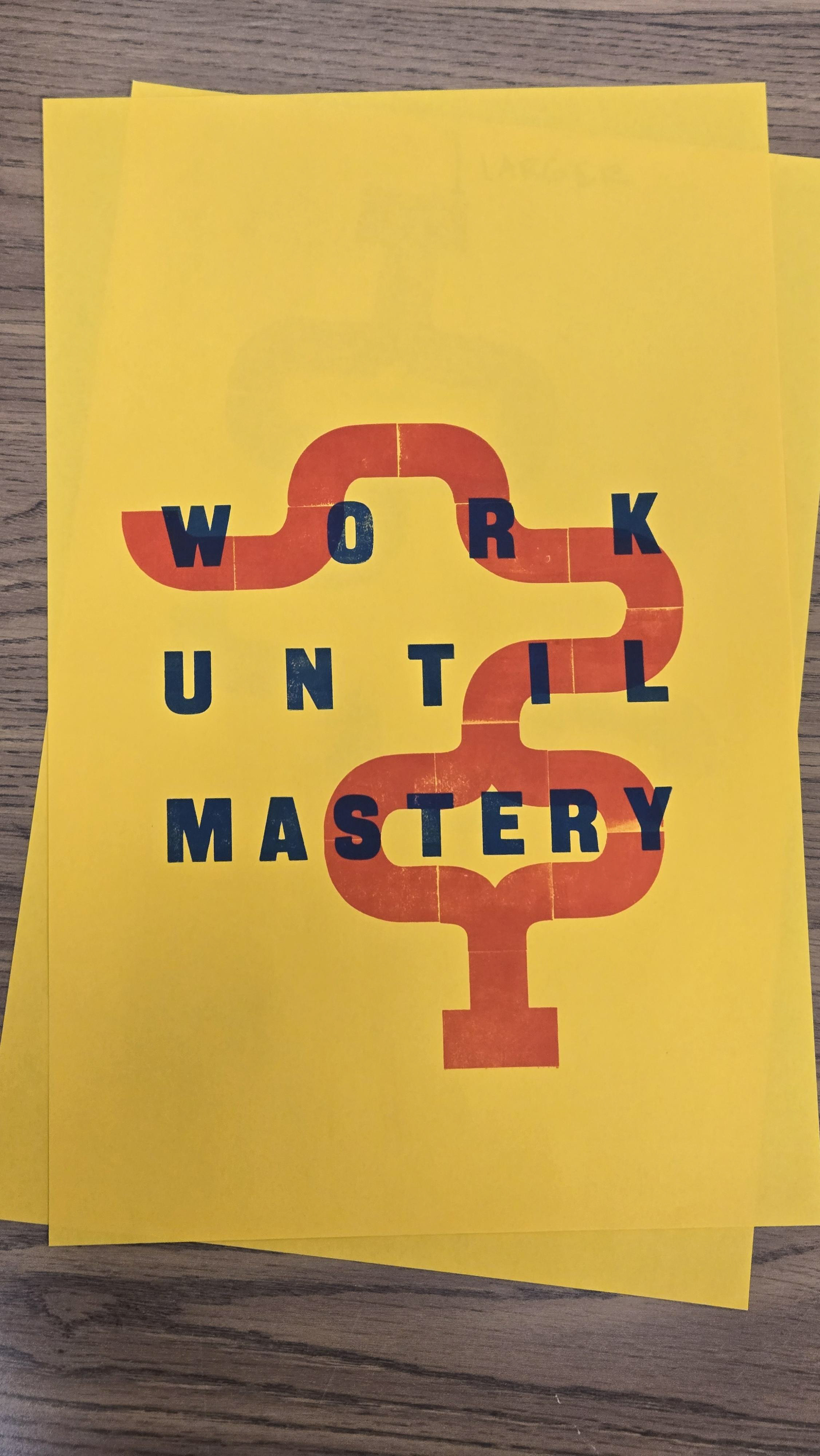
Letterpress typeset
"Work Until Mastery" is a phrase that I was told as I went through middle school and high school. It meant that I was to apply myself in everything I did. I paired this phrase with a red line going through the composition. The line is meant to represent the path we take to mastery. Perfection is impossible, but we should still work as hard as we can.
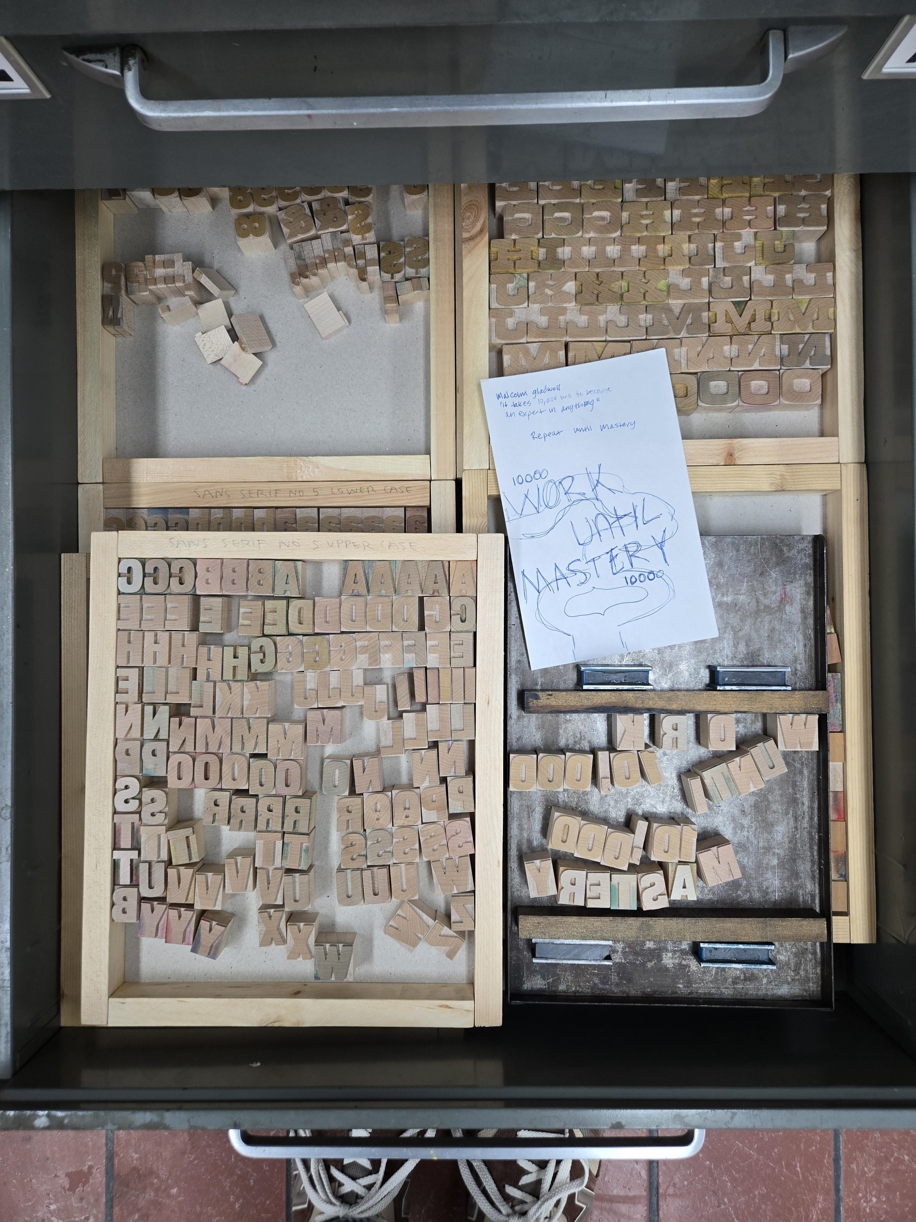
Sketching
I started with a sketch of the phrase I was always taught and the Malcom Gladwell quote, "It takes 10,000 hours to become an expert at anything." I browsed the type drawers and decided to use this sans serif wooden type.
Typesetting
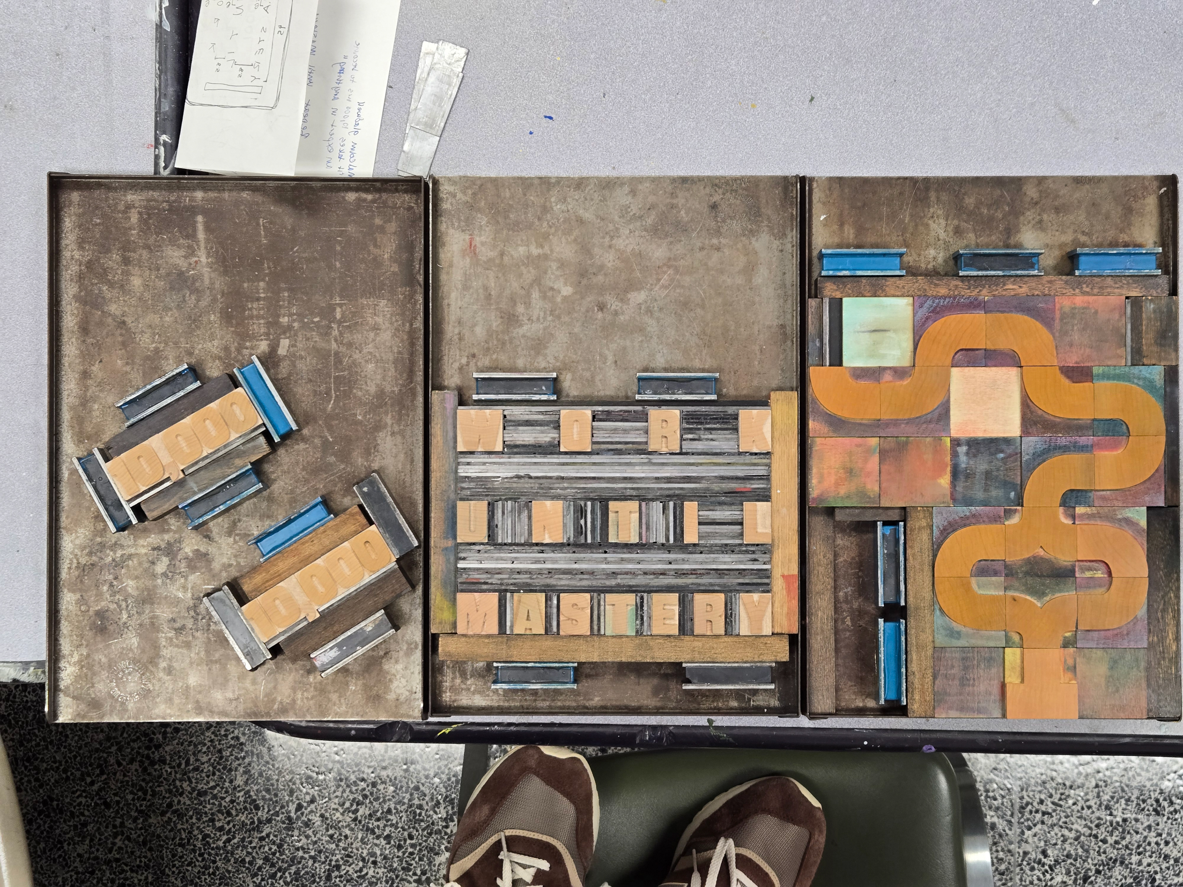
I typeset three different runs of my composition. I used red for the line, navy for the phrase, and I decided to not use the 10,000 run in the final iteration.
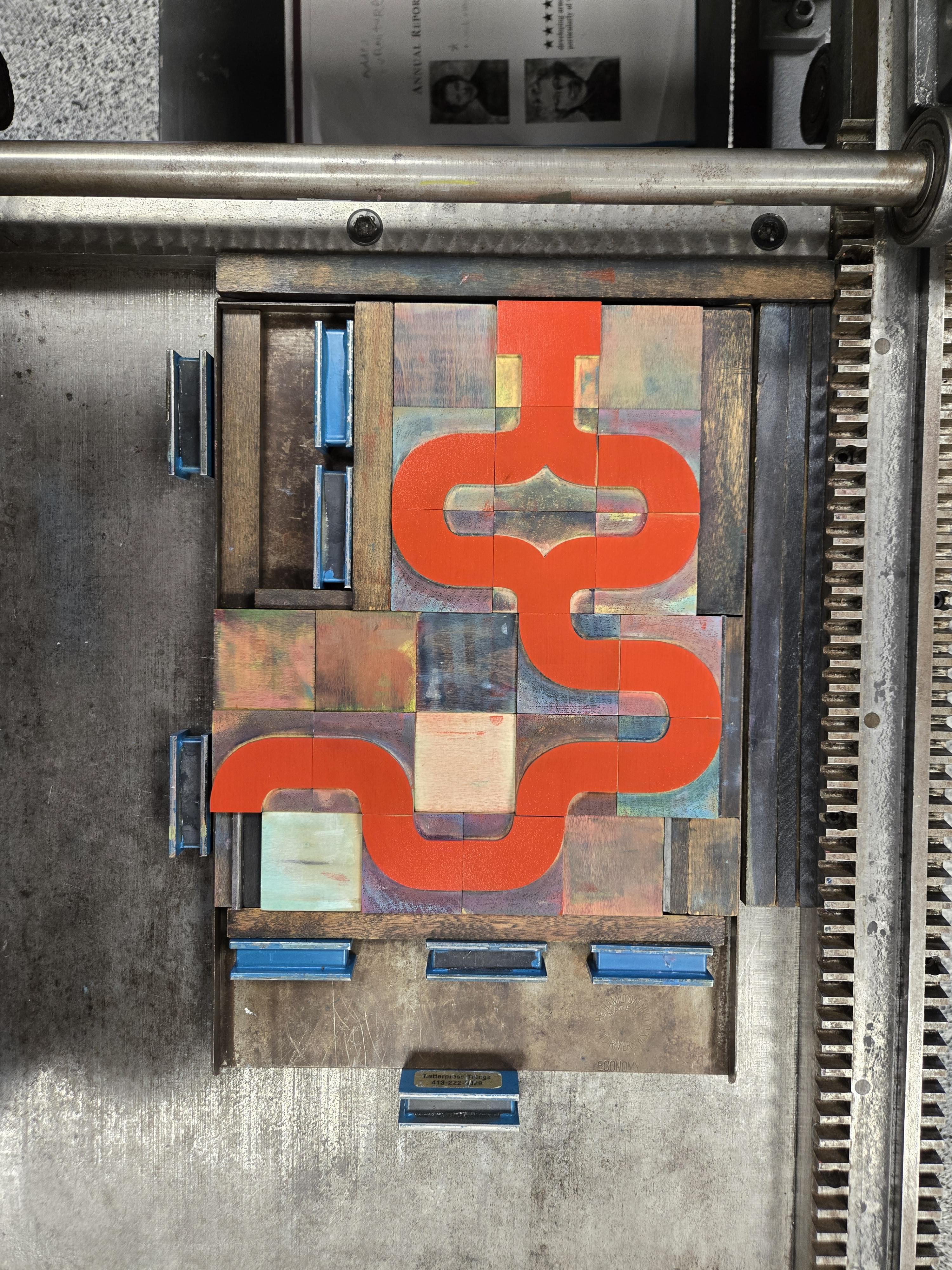
The Red Line
This set is meant to mimic a path. I ran this first through the printing press on yellow paper. This is centered on the page.
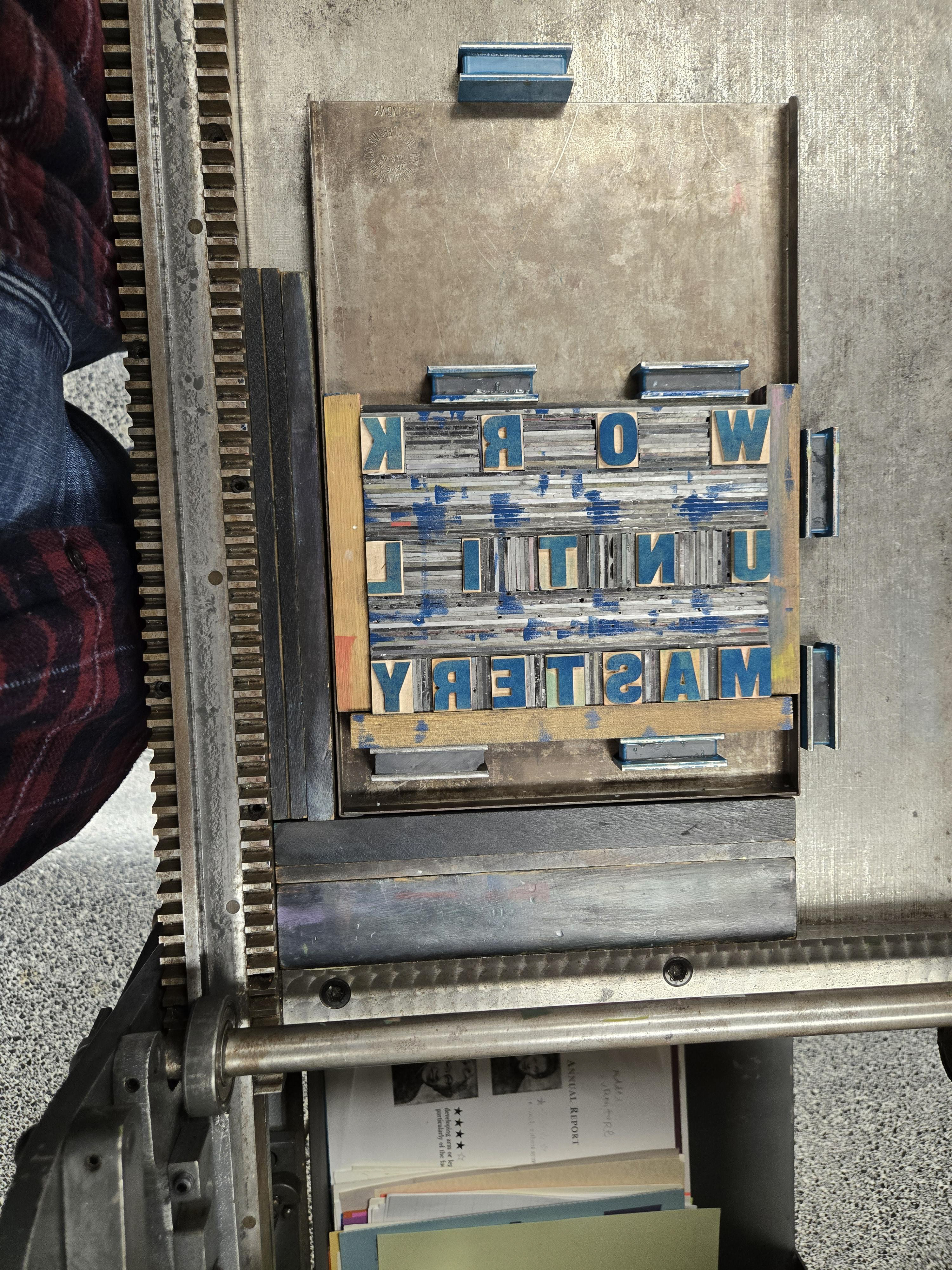
Work Until Mastery
This set is justified in the center of the page. I lined it up with the red path so that it sits in the middle of everything. I also used a darker blue ink so that there wouldn't be a ton of transparency to the red underneath it.
The Final Print
This final print turned out very successful. Letterpress forces the user to be precise and detail oriented. I can't just click a button and center align my text. I have to take the time and measure the space between each letter. It is important to learn the basics of where our art form of graphic design came from. Learning about type in this physical sense pushes my knowledge and skill about typography and graphic design.